How to create a design system to unite your collaborators and cultivate consistency


Building a design system from scratch requires planning, discipline, and the right tools. Whether you're starting with a new product or retrofitting consistency onto an established platform, this guide walks you through every phase: from auditing what you have to maintaining your system as it grows.
What is a design system? Think of it as a shared rulebook for how your products should look and work. It combines reusable building blocks (components), design decisions (tokens), documented patterns, and clear ownership (governance). A good system makes designing and building faster, keeps everything consistent, and makes it easier for teams to collaborate. See the full design system glossary for all terminology.
Looking for the full design systems overview? Start at the design systems hub for service information, case studies, and the broader context around why systems matter.
Why you need this guide: Most design system guides assume you already know the jargon or skip important steps. This one doesn't. At each stage, you'll find plain-English explanations, specific tools to use, and links to resources that go deeper.
“A design system offers a library of visual style, components, and other concerns documented and released by an individual, team or community as code and design tools so that adopting products can be more efficient and cohesive,”

Looking for a design system agency for your design system?
Get in touch to chat about your design system requirements.
Step 1: Audit your current state (component inventory)
What this means: Before you build a system, you need to understand what you're already using. Go through all your products and list every button, form field, card, and other UI element. Note where you have the same thing built different ways, where it causes problems, and where it works well.
Why it matters: Without knowing what you have, you'll either rebuild things that already exist or miss patterns that are causing confusion.
What You're Doing
Document every UI component across all your products. Find overlaps, spot inconsistencies, and flag places where components are causing friction.
How to Do It
Create a spreadsheet to track everything:
- Component name (what it's called: button, card, navigation, etc.)
- How many variations exist (do you have 3 button styles or 8?)
- Where it's used (which products or pages use this?)
- What state is it in (works great, confusing, breaks sometimes?)
- Notes about problems (content too long breaks the layout, users get confused about when to use this)
Tools to use:
- Spreadsheet (Google Sheets, Excel) to organize your inventory
- Screenshot or screen recording tools (Figma, Sketch, or even your phone) to capture what you actually have
- Figma's audit tools if you're already using it for design
Ask yourself these questions:
- How many different shades of blue are we actually using? (Spoiler: probably too many)
- Do all our products use the same navigation? Or does it change?
- Where do components look broken when content is really long or really short?
- Which buttons or interactions confuse people?
- What design decisions are designers making over and over again?
What you'll get out of this: A complete list of every component you have, all its variations, what's working, and what needs fixing. This becomes your roadmap.
Go deeper:
- Check Design System Governance Best Practices to understand who should own this audit and approve the findings
Step 2: Define your foundations (design tokens)
What this means: Design tokens are the basic decisions you make once, then reuse everywhere. Think of them like a colour palette, typography rules, and spacing measurements. Instead of saying "use this shade of blue" 100 times, you say "use primary-blue" everywhere, and if you need to change it, you change it once.
Why it matters: Tokens make consistency automatic. When you build components using tokens, changing one token updates everything that uses it.
What You're Doing
Create a master list of all the design decisions that repeat across your products. These become the building blocks for every component you build.
How to Do It
Define token categories (these are your foundations):
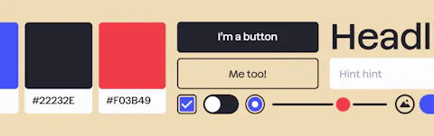
1. Colour tokens (your palette)
- Primary, secondary, and accent colours (the main colours your brand uses)
- Neutral colours for backgrounds, borders, and text (greys and off-whites)
- Semantic tokens (green for success, red for error, orange for warning)
- Make sure colours have enough contrast so text is readable (WCAG standards — check with accessibility tools)
Tools: WebAIM contrast checker (free, shows if your colours work for colour-blind people too), Accessible Colors
2. Typography tokens (how text looks)
- Font choices (what font for headings? what font for body text?)
- Typography scale (H1, H2, H3, body text, small text, captions)
- Line heights and letter spacing (how much space between lines, how much between letters)
- Font weights (regular, medium, bold)
Tools: Type scale generator (helps you create a consistent set of sizes that work together)
3. Spacing tokens (distances and padding)
- Base unit (most systems use 4px, 8px, or 16px as their smallest unit)
- Spacing scale (4, 8, 12, 16, 24, 32, 48, 64 — so every gap is a multiple of your base)
- Padding and margin standards (how much space inside and around components?)
Tools: Spacing generator
4. Shadow tokens (depth and layers)
- Light shadows (small, subtle shadows for small elevation changes)
- Medium shadows (normal shadows for cards or dropdowns)
- Heavy shadows (big shadows for modals or overlays that sit on top)
5. Border radius tokens (rounded corners)
- None (sharp corners)
- Small (subtle rounding)
- Medium (obvious rounding)
- Large (very rounded, like pill buttons)
Create a token reference document that lists:
- Token name (e.g., "color-primary" or "spacing-md")
- Token value (e.g., "#0066FF" or "16px")
- Where it gets used (which components?)
- Why you chose this value (accessibility notes, brand reasoning)
Tools to use:
- Figma variables — use tokens directly in your design file
- Tokens Studio — manage tokens and sync them between design and code
- Supernova — automate token creation and keep design and code in sync
What you'll get out of this: A complete set of reusable design decisions. Every colour, spacing, and typography choice is defined once, and everyone uses the same ones.
Go deeper:
- Automating Design Systems: From Figma to Production in Craft CMS shows how tokens move from design into code automatically
Step 3: Design your atoms (basic components in Figma)
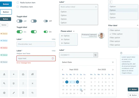
What this means: Atoms are the smallest, most basic building blocks. Think: a button, an input field, an icon, a link. These are things that can't be broken down further. You design each one in Figma using your tokens, showing every possible state (normal, hovered, clicked, disabled, etc.).
Why it matters: Atoms are the foundation everything else is built on. If your button component is solid, every screen using that button will be consistent.
What You're Doing
Create your Figma file where every atom (basic component) is designed, documented, and ready to hand off to developers.
How to Do It
Set up your Figma file structure:
Design System
├── Foundations (your tokens)
│   ├── Colours
│   ├── Typography
│   ├── Spacing
│   └── Shadows
├── Atoms (basic, single-purpose components)
│   ├── Buttons
│   ├── Form Inputs (text fields, checkboxes, radios)
│   ├── Links
│   ├── Icons
│   ├── Tags
│   ├── Badges
│   └── Tooltips
├── Molecules (simple combinations of atoms)
│   ├── Form Groups
│   ├── Cards
│   ├── Text Groups
│   └── Feedback & Validation
└── Organisms (complex, page-level components)
    ├── Navigation Headers
    ├── Modals
    ├── Banners
    └── Forms
For each atom, design all its states:
- Default (normal, not interacted with)
- Hover (when someone's mouse is over it)
- Active/Pressed (when it's being clicked)
- Focus (when you tab to it with keyboard)
- Disabled (when it's not usable right now)
- Loading (if it takes time to process)
- Error state (if something went wrong)
Example: a button atom should show:
- Primary button (default, hover, active, focus, disabled)
- Secondary button (default, hover, active, focus, disabled)
- Small size, medium size, large size
- With icon, with text, with both
Document each atom in Figma:
- What is this for? (purpose: "Use this for primary actions users should take")
- When do you use it? (use case: "Use primary button for the main action on a page")
- What variations exist? (sizes, types, states)
- Any special notes? (accessibility, content guidance)
Link everything to your tokens:
- Button colour uses "color-primary" token (not a hardcoded colour)
- Button spacing uses "spacing-sm" and "spacing-md" tokens
- Button text uses "typography-button" token
- This way, if you change a token, all buttons update automatically
Tools and best practices:
- Use Figma components with variants to handle all your states
- Link your design tokens to Figma variables so they stay in sync
- Use consistent naming (e.g., "Button / Primary / Default" so it's easy to find)
- Keep your master components locked so people can't accidentally change them
Quality checklist:
- Every component uses tokens (no hardcoded colours or spacing)
- Every interactive state is documented and visible
- Names are consistent and searchable
- All text has enough contrast to read (WCAG AA standard)
- Documentation is clear and gives examples
Learning resources:
- Figma design systems guide — official guide to components
- Building scalable design systems — Figma's tips for systems
What you'll get out of this: A complete Figma file with all atoms designed, documented, and ready for developers to build into code.
Go deeper:
- Product Design Blueprint: Engineering Digital Products That Actually Ship (and Scale) — see how components fit into your overall product design
Step 4: Design your molecules & organisms (complex components in Figma)
What this means: Molecules are simple combinations of atoms. A form group is an input (atom) + a label (atom) + an error message (atom). Organisms are complex combinations: a card might have an image, a title, text, and a button. A navigation header is multiple buttons, icons, and logos combined.
Why it matters: Molecules and organisms show how atoms work together. They document patterns your teams use repeatedly.
What You're Doing
Design how atoms combine into simple and complex components.
How to Do It
Molecules (simple combinations):
- Form group (label + input field + helper text)
- Input with icon
- Card header (image + title + metadata)
- Text with icon
Organisms (complex, often page-level):
- Navigation headers
- Cards (image, title, description, button)
- Modals and dialogs
- Form sections (multiple form groups with a heading)
- Banners and alerts
- Search bars with suggestions
- Filters and sorting controls
For each molecule and organism:
- Build it using your atoms (don't recreate buttons, use the button component)
- Show variations if they're significantly different
- Document when to use it and when not to
- Link to the atoms that make it up
Document everything in Figma:
- Purpose and use case
- Which atoms are inside it?
- Any special rules or constraints?
- Content guidance (how much text can fit? how many items can go in a list?)
What you'll get out of this: A complete design system showing how basic components combine into page patterns.
Go deeper:
- Product Design Blueprint: Engineering Digital Products That Actually Ship (and Scale) — understand patterns in the context of full product design
- Automating Design Systems: From Figma to Production in Craft CMS — how these patterns translate to code automatically
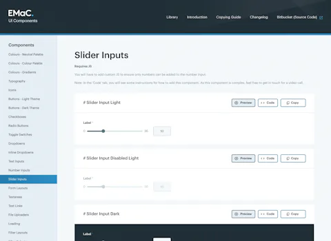
Step 5: Build your component library (developers build the code)
What this means: Designers have defined everything in Figma. Now developers write the actual code so teams can use these components in real products. This is where design becomes usable infrastructure.
Why it matters: A component in Figma is just a picture. A component in code is something you can actually use, test, and deploy.
What You're Doing
Translate your Figma designs into production-ready code. Create a documented, tested component library.
How to Do It
Choose your tech stack (what tools and languages will you use?):
- React: Storybook for docs, Tailwind CSS or Styled Components for styling
- Vue: Histoire or Storybook, Composition API
- Vanilla JS: Web Components, CSS Custom Properties
- Documentation site: Docusaurus, Gatsby, Eleventy
Organize your code:
component-library/
├── src/
│   ├── components/
│   │   ├── Button/
│   │   │   ├── Button.js (the component code)
│   │   │   ├── Button.css (styling)
│   │   │   ├── Button.test.js (tests)
│   │   │   └── Button.stories.js (documentation)
│   │   ├── Input/
│   │   ├── Card/
│   │   └── (all other components)
│   ├── tokens/
│   │   ├── colours.js (colour variables)
│   │   ├── typography.js (font sizes, weights)
│   │   └── spacing.js (gap sizes)
│   └── styles/
│       └── global.css
├── docs/ (documentation website)
└── package.json
For each component, create:
- Component code (HTML, CSS, JavaScript)
- Tests (make sure it works correctly)
- Storybook story (show every variation)
- Clear documentation
Document each component clearly:
## Button Component

### What is it?
A clickable element that triggers an action. Users click it to submit forms, navigate, or start a process.

### When to use it
- Primary actions (main thing you want users to do)
- Secondary actions (less important actions)
- NOT for navigation between pages (use links instead)

### Variations
- Size: small, medium, large
- Type: primary, secondary, ghost
- State: default, hover, active, disabled, loading

### How to use it
<code example>

### Accessibility
- Works with keyboard (Tab key)
- Works with screen readers
- Has clear focus state
- Text has enough contrast

### Common mistakes
- Using a button for navigation (use a link instead)
- Button text that's too vague ("Click here" instead of "Save Changes")
- Buttons with not enough contrast (text hard to read)
Test your components:
- Unit tests (does the button do what it's supposed to?)
- Visual tests (does it look right in different browsers?)
- Accessibility tests (can people with disabilities use it?)
Tools:
- Storybook — show every component variation, test them
- Testing Library — test how components work
- Chromatic — check if components look right in different browsers
- axe DevTools — find accessibility problems
What you'll get out of this: A tested, documented component library developers can actually use.
Go deeper:
- Automating Design Systems: From Figma to Production in Craft CMS — how to keep design and code in sync with living infrastructure
- Product Design Blueprint: Engineering Digital Products That Actually Ship (and Scale) — fit components into your overall product design process
Step 6: Set up governance (rules and ownership)
What this means: Who decides what goes in the system? How do teams propose new components? What happens when something needs to change? These are governance questions. Governance is the structure that keeps your system from becoming a mess.
Why it matters: Without governance, teams build things outside the system. With good governance, everyone knows the rules and the process is clear.
What You're Doing
Define who owns the system, what the approval process is, and how teams contribute.
How to Do It
Create a governance document that answers:
1. Ownership and roles
- System owner (who makes final decisions?)
- Component maintainers (who's responsible for which components?)
- Approval process (who approves new components?)
- Contribution guidelines (how do teams propose changes?)
2. Component lifecycle
- How do you propose a new component? (issue? meeting? Slack message?)
- What does the approval process look like?
- How do you know a component is finished and ready to use?
- When do you deprecate (retire) old components?
- How do you version your system?
3. Update frequency
- How often do you review the system? (monthly? quarterly?)
- How do you communicate changes?
- How do you handle breaking changes that affect teams?
4. Contribution workflow
- Can anyone contribute code?
- What testing and documentation is required?
- How do you review contributions?
Tools for governance:
- GitHub or GitLab (version control, track who contributed what)
- Code Owners (specify who owns each component)
- Slack or Teams (communication about changes)
- RFC (Request for Comment) process (for big changes, get input before deciding)
What you'll get out of this: Clear rules everyone understands and can follow.
Go deeper:
- Design System Governance Best Practices — detailed governance strategies
- How Design Systems Reduce Cost and Improve Team Efficiency — how good governance speeds up work
Step 7: Make it the default (adoption)
What this means: A system nobody uses is useless. Adoption means designers and developers actually reach for the system instead of building their own stuff.
Why it matters: The system only saves time and creates consistency if teams actually use it.
What You're Doing
Make using the system easier than building custom solutions.
How to Do It
For designers:
- All new design work starts in the design system Figma file
- Use component instances, don't recreate elements
- New requests go through governance, not around it
- Check designs against the system during reviews
For developers:
- Import components from the library, don't rebuild them
- Use design tokens for all colours, spacing, typography
- Follow the system instead of writing custom code
- Code reviews check for system compliance
Make it easy to use:
- Put the component library where people naturally look (bookmark it)
- Add it to team onboarding (new people learn it first)
- Share updates regularly (what's new? what changed?)
- Celebrate work built with the system (show real examples)
- Track compliance (audit recent projects, find violations)
Enforcement:
- Design reviews (does this design use approved components?)
- Code reviews (does this code use the component library?)
- Linting rules (automated tools catch token violations)
- Analytics (track which components are most used, which are never used)
What you'll get out of this: A system your teams actually use every day.
Go deeper:
- Design System Governance Best Practices — enforcement strategies
- How Design Systems Reduce Cost and Improve Team Efficiency — measure the impact of adoption
Step 8: Keep it current (maintenance and evolution)
What this means: Your system doesn't stay the same. As products change, user needs change, and technology changes, your system evolves too. Maintenance is the ongoing work to keep it useful.
Why it matters: An outdated system becomes ignored. A current system stays valuable.
What You're Doing
Keep your system responsive to team needs and product changes.
How to Do It
Build a regular rhythm:
Monthly:
- Fix bugs in components
- Update documentation
- Address feedback from teams
- Small improvements
Quarterly:
- Major review with designers and developers
- What new components do we need?
- What should we retire?
- What's causing problems?
- Plan next quarter's work
Annually:
- Full audit of system health
- Is tooling still good? Do we need new platforms?
- Big strategic improvements
- Measure ROI (did it save time? improve consistency?)
Track usage:
- Which components are most used?
- Which are never used? (candidates for retirement)
- Where are teams building custom solutions outside the system?
- What new patterns are emerging from real work?
Communicate changes:
- Release notes (what changed? why? how do I update?)
- Changelog (always accessible, always current)
- Announcements (Slack, email, docs)
- Migration guides (help teams update their code)
Deprecation (retiring old components):
- Announce 2-3 months before removing something
- Provide a replacement component
- Help teams migrate their code
- Support during transition
Tools:
- Semantic versioning (version numbers tell you if changes are big or small)
- GitHub releases (track all changes)
- Slack/Teams (communicate with teams)
- Analytics (see which components get used)
What you'll get out of this: A system that stays useful and improves over time.
Go deeper:
- The Future of Design Systems — where design systems are headed
- Design System Governance Best Practices — governance at scale
- How Design Systems Reduce Cost and Improve Team Efficiency — measuring ongoing impact
Measuring impact
Once your system is live, track its value. Design systems save time, reduce mistakes, and improve teamwork. You can actually measure this.
Metrics to track:
Speed (how fast teams work):
- Time to design a new screen (before vs. after having the system)
- Time to build a new feature (before vs. after)
- Number of design meetings needed to agree on things (should go down)
- How fast you can ship new features
Consistency (things look and work the same):
- Percentage of designs using system components (look at 10 recent projects)
- Percentage of code using system components
- How many accessibility problems do you have? (should go down)
Adoption (teams actually use it):
- What percentage of teams use the system?
- How many projects have been built with it?
- How often do teams use each component?
- Are new teams adopting it quickly?
Cost savings (money and time saved):
- Design hours saved per month
- Development hours saved per month
- Less rework and fixing bugs
- Less duplicate work
Quality (fewer problems):
- Bug reports in system components vs. custom code (system should have fewer bugs)
- Accessibility issues fixed
- Team satisfaction (do people like using it?)
Calculate your ROI (return on investment):
Use the Design System ROI Calculator to see the business impact.
Read How Design Systems Reduce Cost and Improve Team Efficiency for examples of real cost savings and efficiency gains.
Key resources
Honcho design systems (go deeper on these topics):
- Design systems hub — overview of design systems, services, and resources
- Design System Glossary — comprehensive terminology: atomic design, components, tokens, governance, and more
- Design System Governance Best Practices — detailed guidance on ownership, approval workflows, and scaling governance
- How Design Systems Reduce Cost and Improve Team Efficiency — the business case, ROI calculations, and real cost savings
- The Future of Design Systems: The Death of the Static Library and How AI is Rewriting It — where systems are headed, AI trends, dynamic vs. static systems
- Product Design Blueprint: Engineering Digital Products That Actually Ship (and Scale) — how design systems fit into the overall product design process
- Automating Design Systems: From Figma to Production in Craft CMS — living infrastructure, design tokens, automation workflows
Design and tokens (tools):
- Figma design systems — design components in Figma
- Tokens Studio — manage design tokens
- Supernova — token automation
- Type scale generator — typography
- WebAIM contrast checker — colour accessibility
Component library (tools for developers):
- Storybook — document and test components
- Testing Library — test components work correctly
- Chromatic — visual testing
- axe DevTools — accessibility testing
- Docusaurus — documentation websites
Governance and versioning:
- Semantic versioning — version numbering explained
- RFC process — making big decisions together
- GitHub Code Owners — track who owns what
Ready to build?
Creating a design system is a real investment. Maintaining it is ongoing work. But when done right, it makes your whole team faster, reduces mistakes, and keeps everyone aligned on what quality looks like.
If you want help building a design system, get in touch. We've built systems for small teams and large organisations. We know what works.
Looking for a design system specialist?
Get in touch to see how we can help create a design system that unites your collaborators and cultivates consistency.


Mole has been working in the design industry for over 13 years, and in that time gained a wealth of experience creating powerful brands

Reviewed by
Ben HartleyMole has been working in the design industry for over 13 years, and in that time gained a wealth of experience creating powerful brands
Reviewed by
Ben Hartley