Product design blueprint: Engineering digital products that actually ship (and scale)

Oh hello there, pull up a chair. Grab a coffee. We have a lot to talk about.
I am Ben, the Creative Director at Honcho, and today I am going to talk to you about how our team handles its product design projects. For us, there is absolutely nothing more exciting than working with an organisation and overseeing the strategy, planning, and execution of a new product. Being able to provide our expertise and then see how the output at the end of the journey transforms a business gives us a real buzz. It is exactly why we love what we do.
This article is intended to explain our product design process in great detail. I am taking you behind the scenes of how we work with our clients. We will move from initial discovery sessions through user research, user interviews, user behaviour analysis, and finally into the high-performance world of design systems and production-ready code.
If you are going to invest your budget into building something new, you need to know exactly how the sausage is made. Let us dive right in, sausage first.
Understanding the true product design process
In case you are new to this space, product design is the end-to-end process of envisioning, planning, and building digital products that solve real user problems and drive tangible business outcomes. More money anyone?
In today’s highly competitive digital landscape, mastering this design process is critical for business success. This remains true whether you happen to be a product owner, a seasoned developer, or a stakeholder responsible for delivering high-impact digital experiences.
The entire product lifecycle
Product design encompasses the entire product lifecycle. This journey stretches from initial ideation and deep research through to development, launch, ongoing refinement, and even end-of-life management. The product designer's role is central to this entire operation.
A product designer oversees the entire product lifecycle, balancing creative design and strict business considerations. They collaborate closely with disciplines such as UX design and product management to ensure that the proposed solution aligns perfectly with both user needs and business objectives.
Digital products vs industrial design
It is important to understand the broader concept here. We are not talking about industrial design. Industrial design is a professional discipline focused on creating physical products, balancing functionality, aesthetics, and manufacturing considerations for objects you can actually hold in your hand. While the core philosophies often overlap, digital product design focuses entirely on how users interact with interactive systems on screens. We are building software, mobile apps, and complex web platforms.
The UX design process and interaction design foundation
Most digital products fail. Sad face. They do not fail because they look bad, but because the gap between a pretty Figma file and a functional browser is a chasm filled with wasted budget and developer frustration. According to Forbes, a staggering 70 per cent of digital transformation projects fail. That is billions of pounds worth of sausage set on fire every single year.
To prevent this, we lean heavily on principles championed by the Interaction Design Foundation. The Interaction Design Foundation provides the academic and practical bedrock for understanding human system interaction. They teach us that every design solution must begin with a deep understanding of the end user. UI design, which is distinctly different from UX design, focuses on the visual and interactive aspects of digital interfaces. It is about creating aesthetically pleasing and user-friendly layouts that enhance the overall user experience. This guide covers the entire product design process for digital products, ensuring your team can finally bridge the gap between beautiful concepts and functional, scalable engineering.
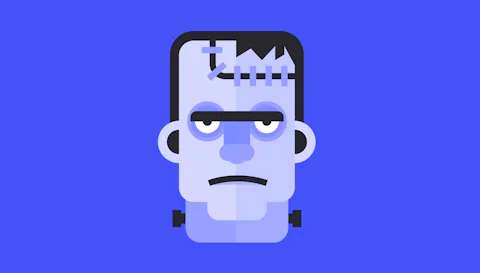
The Frankenstein effect and design debt
Before we dive into the specific phases of our work, we need to address the elephant in the room. Why do so many products end up looking terrible and functioning even worse?
The cost of communication gaps
If you are a Product Owner, you have likely felt the "Figma Friction." It is that painful moment when the beautiful, high-fidelity designs you signed off months ago finally make it to a staging environment, only to look like a distant, slightly dishevelled cousin of your original vision. This is not just an aesthetic issue. It is a symptom of a fractured process.
When design teams and development teams live in silos, communication gaps widen. Designers create products in a vacuum, and developers try to interpret them without context. This leads to massive misunderstandings that contribute directly to product stagnation.
How do Honcho solve this?
By completely tearing down the wall between design and engineering with a strict, multi-layered Quality Assurance process.
We do not just throw files over a fence and hope for the best. First, we run a rigorous Dev QA, where the engineering team tests the codebase against the technical specifications and functionality requirements.
Once that passes, we enforce a dedicated Design QA. This is where the original UX designers review the staging environment to ensure absolute pixel perfection, comparing the live build directly against the Figma files to catch any visual or interactive drift.
Finally, we execute a holistic QA stage. This final review looks at the entire product as a complete ecosystem, ensuring the user experience flows seamlessly, the core user needs are met, and the overarching business goals are achieved before a single customer ever sees the live product.
Accumulating design debt
If you aren't carefully QA'ing, these communication gaps make you inherit design debt. Design debt is the accumulation of inconsistencies and inefficiencies in a product’s design, often due to shortcuts, lack of standards, or legacy hacks.
It starts incredibly small. You might notice a rogue button style here or a non-standard padding value there. Perhaps a graphic designer used a font weight that does not quite match the brand guidelines your team relies on.
I kid you not, we've had websites handed to us with different buttons on every page 🤦.
Before you know it, your product is a patchwork of inconsistent visual elements that confuse users. At Honcho, we call this the Frankenstein effect. It kills conversion, bloats your codebase, and makes scaling almost impossible because every new feature requires hacking onto a broken foundation.
The Honcho reality check: According to research by the IEEE, developers spend up to 50 percent of their time reworking code that is completely avoidable. Design debt is not just ugly. It is a massive financial drain on your engineering resources.
To build a market-leading product, you need a water-tight engineering blueprint that connects business goals with production-ready code. At Honcho, we deliver clean, ready-to-go Tailwind CSS components that your developers can plug right in, cutting down on the usual back-and-forth entirely.
Roles in product design
For your reference, I'll quickly wizz through the different roles involved in digital products. As you may be aware, creating a digital product that actually works takes a lot more than just a good idea. You need a cross-functional team that knows how to translate a boardroom vision into something a human being can actually use. You need different people with different skills to come together flawlessly, which is exactly how we operate as a specialist digital product agency. So who's involved in the process?
Product managers
Welcome to the engine room. Product managers look at the "How" and "When." They manage the entire product lifecycle, clearing roadblocks and ensuring that products actually make it to market on time and under budget. They are responsible for making sure the product aligns perfectly with the initial business objectives. Just so you are aware, this is often a thankless job, so thank you, PM's!
UX designers
These are the brilliant architects of the user experience. UX designers do not just make things look pretty. They map out the information architecture, the complex user flows, and the underlying logic. Graphic designers and UI experts then step in to craft the stunning visual elements. Together, they balance the aesthetic with the highly functional, so the product is as usable as it is beautiful. They take ownership of the user interface design, which is the visual layer that makes a complex system feel wonderfully simple.
The stat: Research published in the ACM Digital Library shows that 94 percent of user first impressions are strictly design-related. If the interface design fails to build immediate trust, the underlying technology simply does not matter. The user is already gone.
The user researcher
This person is the ultimate truth-teller. They go out, collect user feedback, and bring back the sometimes uncomfortable data-driven insights that prove your genius boardroom idea might actually be confusing everyone. By utilising strict usability testing, focus groups, and one-on-one user interviews, they keep the entire team grounded in reality. They develop a deep understanding of user behaviour and hidden pain points.
Phase 1: The discovery session
Let us get into the actual sausage meat of the process. Most product failures can be traced directly back to the first forty-eight hours of a project’s life. It is during this honeymoon period that dangerous assumptions are mistaken for facts. At Honcho, we treat the start of a project with a level of clinical rigour through our Discovery Workshop, plus, it's fun!
We do not just sit around a sterile boardroom table nodding at each other. This is a highly interactive process hosted entirely in FigJam. We get all the key stakeholders into a shared digital workspace and visually map out the entire ecosystem before a single pixel of UI is drawn. We cover a massive amount of ground to ensure absolutely nothing is missed. This interactive mapping includes:
- Identifying the exact problem we are actually trying to solve.
- Defining what success looks like through clear goals and measurable targets.
- Profiling users to map out their core goals and their biggest daily frustrations.
- Analysing competitors to see where we can gain a distinct advantage.
- Flagging risks and dependencies that could derail the project later.
- Reviewing the brand and visual identity to ensure visual messaging aligns with the new strategy.
- Establishing accessibility standards to ensure the product works for everyone.
- Mapping the current system landscape to understand existing technical constraints.
Identifying the target audience
This FigJam session is a forensic deconstruction of your business goals. As part of this process, we identify your target audience and uncover their exact pain points. We must ensure the product design addresses real user needs right from the outset. Understanding user motivations is central to our entire user centric approach. We use methods such as focus groups to collect user feedback during the discovery phase, allowing us to gain valuable, actionable insights that inform the rest of the design process.
Challenging the proposed solution
If you are looking for an agency to simply nod along to your ideas and pick out a trendy colour palette, you are in the wrong place entirely. Our Discovery Workshop is designed to be an enlightening, and occasionally blunt, discussion. This is similar in spirit to our in-depth UX audit process for digital products. We challenge your business objectives because what a stakeholder thinks they need is often just a symptom of a much deeper problem.
"If I had an hour to solve a problem, I would spend 55 minutes thinking about the problem and 5 minutes thinking about solutions." Albert Einstein had it right, and it is the exact philosophy that drives our Discovery Workshops.
We start by stripping the product back to its absolute bare bones to properly identify the problem. What is the fundamental issue we are solving here? Who loses money if this fails? What are the hidden risks and dependencies lurking in your current system landscape?
Defining key business outcomes
A beautiful product that does not achieve its business outcomes is a monumental failure. This is why we pivot the conversation from how it should look to how it should perform. We help you define Key Performance Indicators (KPIs) that are rooted in reality, not vanity metrics. We clearly establish what success looks like from day one. User feedback from the end user is absolutely essential in defining and refining these KPIs.
When we work with complex software suites, the KPIs are often highly operational. We look for metrics such as Time to Completion for core tasks. If a call centre agent is spending ninety seconds navigating a convoluted menu to provide a simple service estimate, that is a KPI waiting to be optimised. If we can reduce that time to thirty seconds through better UX, we have just saved that business thousands of man-hours per year. This is the distinct difference between mere pixel-pushing and actual product engineering. We ensure every single design decision is a calculated move toward true business success.
The business case: The McKinsey Design Index tracked 300 publicly listed companies over five years. They found that companies with top-quartile design scores outperformed industry-benchmark growth by two to one. Good product design is a literal revenue multiplier.
Let us be entirely clear about one thing. We might not get the answers to every single question during this initial discovery session, and that is perfectly fine.
What this workshop actually does is lay the fundamental foundation. It highlights the exact gaps in our collective knowledge and gives our team the precise roadmap we need to go away, dig deep into the data, and find those answers before we start building.

Phase 2: Deep user intelligence and solid logic
Once the business goals are nailed, we turn our focus to the people actually using the product. If you do not know exactly who you are building for, you are just guessing with your budget. We believe the User in User Experience is not a hypothetical concept. It is a collection of specific skills, motivations, and frustrations.
Understanding the "user" in the experience
User experience design (and user experience UX) are centred entirely on understanding how users interact with products. It focuses heavily on a person's perceptions, including their feelings, beliefs, and overall impressions of a product, system, or service. Luckily, they are the very same principles that underpin our web design, development, and branding processes.
Gaining a deep understanding of user needs and behaviour is absolutely essential for effective product design. UX design focuses on optimising every single touchpoint where users interact with the product, ensuring intuitive, satisfying, and effective experiences.
Conducting user interviews
We do not guess what your users want. We ask them. But more importantly, we watch them. We identify individuals within your defined user groups and conduct one-to-one user interviews to determine how they are currently interacting with your interactive systems. We actively look for the workarounds.
Usually, if a user has developed a cheat or a hack to get a task done, it is because your current UX is failing them. They are leaking value every single time they have to take a manual shortcut. We find these weaknesses and turn them into brilliant opportunities to add value. These insights prevent us from building a beautiful interface that users still have to fight against to get their work done.
The Nielsen Norman rule: You do not need a focus group of a thousand people. The Nielsen Norman Group proved that testing with just five users will uncover 85 percent of all usability problems. Deep user intelligence is faster and more accessible than most stakeholders realise.
Applying the Nielsen Norman Group standards
We subscribe heavily to the school of thought led by the Nielsen Norman Group. The Nielsen Norman Group defines user experience as encompassing all aspects of the end user's interaction with the company, its services, and its products. Our experts use strict UX laws and deep user testing to create interactive systems that do not just meet user expectations, but completely shatter them.
User intelligence is not just about fixing what is broken. It is about finding what is missing. By studying the user journey from start to finish, we can often spot strategic opportunities to increase revenue or engagement that were previously invisible. We look for these pockets of opportunity where we can cross-pollinate services or massively increase conversion rates. To ensure we are travelling in the right direction, we use our user intelligence to define additional KPI's as measurable goals for user satisfaction.
Phase 3: The greyscale prototype and risk mitigation
Website or product design is inherently expensive and extremely high-risk. If you jump straight into high-fidelity visuals, you are essentially building a house and picking out the expensive wallpaper before you have checked if the plumbing works, or packing a sausage without grinding the meat 🤣.
At Honcho, we mitigate this immense risk through a low-commitment, high-impact prototyping phase.
Mapping the exact user flows
Before we even think about opening our prototyping tools, we obsessively map out the exact user flows. A user flow is the precise, step-by-step journey a person takes to achieve a specific goal within your product. Think of it as the strict GPS routing for your software. We document every click, decision point, and potential error state. If a user needs to upgrade their subscription or recover a lost account, what is the absolute path of least resistance to get them there? By defining these user flows early, we expose dead ends and convoluted logic loops before we draw a single wireframe. It is all about removing friction from the human system interaction. If it takes six clicks to do a task that should take two, our user flow mapping highlights that failure immediately.
Leveraging prototyping tools
Next, based of the user flows, we build a fully interactive, greyscale prototype that serves as the skeletal structure of your product. We use industry-leading prototyping tools to design, test, and refine user interfaces and experiences before full implementation. This prototyping phase is a critical step to create products that are both functional and user-friendly, ensuring the final proposed solution meets user needs flawlessly and feeds directly into our custom web development process.
The cost of skipping prototypes: The IBM Systems Sciences Institute found that fixing a software error after development is up to 100 times more expensive than finding it before development. Our greyscale prototypes are your ultimate insurance policy against astronomical rework costs.
Information architecture first
There is a highly specific psychology behind why we work in greyscale at this stage. When a stakeholder sees a beautiful, full-colour design, their brain immediately pivots to subjective aesthetics. They will say they do not like that shade of blue or ask if we can make the logo pop.
At this stage, we do not care about the blue; just leave it out, Alan, move on from the blue. We care about the flow. Visual design elements, including deep colour theory, are intentionally set aside until the product's usability and core structure are completely validated. By removing brand elements, we force every stakeholder to focus solely on the information architecture. We look at the usability, the functionality, and the content hierarchy. We ask the difficult questions. Does this element promote trust in the experience? Does this button lead exactly where the end user expects? Is the most important information the most prominent?
Rigorous usability testing
We use these interactive wireframes to stress-test the user journeys we defined in the strategy phase. We put these prototypes in front of your actual users to gather real-world feedback. Usability testing involves diverse user groups, including people with disabilities, to identify accessibility issues early. If a user struggles to complete a core task in a greyscale wireframe, no amount of pretty UI design is going to save them in the final build.
Phase 4: The design (UI)
With the skeletal structure of the prototype officially signed off and the plumbing of the product proven, we move into building the high-performance engine. At Honcho, we do not view a design system as a simple UI kit. It is a strategic corporate asset. It is the architectural framework that ensures every screen, every interaction, and every brand touchpoint feels wonderfully coherent.
Visual elements such as icons, graphics, and colour schemes are strictly standardised within the design system to maintain flawless consistency across all product design outputs, following the same principles we outline in our guide on how to create a design system for your organisation.
A well-crafted design system is built from the ground up using Atomic Design principles. This brilliant methodology breaks interfaces into fundamental building blocks. We start by defining the atoms and foundations. These are the absolute smallest building blocks of your product, including typography scales, colour palettes, spacing systems, and grid structures. We define a functional colour system that accounts for strict accessibility, state changes like hover or active states, and dark mode compatibility.
Creating the component library
Once the atoms are set in stone, we combine them into key components. These are the functional molecules and organisms of your product. We build navigation bars, complex form inputs, massive data tables, and beautiful card layouts. These components are designed to be entirely flexible and reusable, mirroring the way we approach design system creation for organisations.
Instead of a designer pixel-pushing a new button for every single page, they pull a pre-built, heavily tested component directly from the component library. This approach virtually eliminates design debt. It acts as a single source of truth for your entire organisation. If your brand evolves and you need to update a specific component, you change it once in the system, and it ripples through the entire product automatically.
Figma as a collaborative hub
We build our design systems within Figma’s collaborative environment. This setup allows for live updates across teams and ensures that your product managers and stakeholders are all looking at the same latest version at all times. This collaborative environment also makes it incredibly easy to collect user feedback through stakeholder reviews, allowing you to quickly iterate and refine your product design based on real, tangible insights before we translate everything into high-performance Craft CMS builds.
This level of systemisation is exactly what allows market leaders to scale at pace. A documented design system allows new designers to ramp up in days rather than weeks. This ensures a unified customer experience that builds immense trust and reinforces your brand loyalty at every turn.
Phase 5: The Tailwind bridge and engineering reality
If there is one single point where digital products fail, it is the handoff. You have likely experienced the Design-to-Dev Gap. It is that awkward space where a pixel-perfect Figma file is handed over to a developer who then has to spend weeks guessing CSS values, interpreting margins, and reverse-engineering complex shadow depths.
Bridging the gap in interface design
At Honcho, we have effectively dynamited that bridge. We do not just hand over a visual design. We deliver clean, perfectly formatted Tailwind CSS components. We also leverage advanced tools to automate tasks and streamline the design-to-development handoff, ensuring a smoother, massively more efficient workflow for both designers and developers.
By delivering your user interface as a library of clean, reusable Tailwind CSS components, we provide the ultimate peace treaty between your design and development teams. We take the atoms we built in Figma and translate them directly into code-based variables and utility classes.
This eliminates the eye-balling phase of development completely. Your dev team does not have to spend hours writing custom CSS files that bloat your site and slow down your load times. They receive a lean, highly performant, and pre-vetted component library that mirrors the design system mathematically perfectly.
By using Tailwind CSS, we enable a modular workflow that allows your product to scale at a speed most agencies cannot match. We build the foundational styles and components as functional blocks. If you need a new landing page, your developers can assemble it using the existing Tailwind components in a fraction of the time it would take to build from scratch. This methodology prepares your product for modern headless setups or traditional CMS environments.
We do not just code for aesthetics. We code for raw performance and inclusivity. We bake accessibility considerations directly into the HTML and CSS from day one. We ensure that keyboard navigation, screen reader support, and perfect colour contrast ratios are standard. Furthermore, because Tailwind only ships the CSS you actually use, your product remains incredibly lightweight and blazingly fast.
Phase 6: Embracing continuous learning and design improvements
A digital product is never truly finished. It is a living, breathing entity that must constantly evolve as your market changes and your user base grows. Embracing continuous learning within your team is absolutely essential. Ongoing education and adaptability enable rapid iteration and effective feedback incorporation to manage uncertainty as your product design evolves.
The greatest danger to a new product is that, six months after launch, the internal team begins to drift away from the established system. This is exactly how design debt creeps back in. To prevent this disaster, we build a robust framework for long-term governance. Our ultimate goal is to make ourselves redundant. We want your team to have full autonomy over the product’s future.
To support this transition, we create a bespoke Training Hub. This is a collection of high-impact, short-form videos and rich documentation designed for the people who will actually be using the system day-to-day. We cover the practicalities of how to pull components from the component library, how to apply Tailwind utility classes to new pages, and how to maintain the Auto Layout logic. We show your Product Managers exactly how to maintain oversight on quality and standards, driving continuous design improvements, all rooted in our agency culture and ways of working.
Engineering the future of your digital product
Digital product design is a high-stakes sausage game. You can choose a fragmented process full of guesswork, or you can choose the Honcho process. By prioritising risk mitigation, deep user intelligence, and exact code-based delivery, you turn product design from a gamble into an engineering certainty.
Great product design not only enhances the customer experience but also fosters deep brand loyalty by delivering consistent, highly positive interactions across every single touchpoint. As emerging technologies like artificial intelligence and augmented reality continue to drastically shape the future of product design, staying ahead means embracing real innovation that transforms human system interaction and user engagement.
"Design is not just what it looks like and feels like. Design is how it works." That quote from Steve Jobs remains the ultimate truth in our industry. Forrester Research has consistently shown that every dollar invested in UX brings a return of 100 dollars. It is an investment that pays for itself countless times over.
You are not just buying a new user interface design when you work with us. You are buying a highly scalable engine for your business. This approach provides a massive competitive edge and serves as a key differentiator through superior experience. The product aligns perfectly with what the market demands, ensuring long-term business success.
Are you ready to stop pixel-pushing and start engineering? Let us discuss how we can turn your product vision into a scalable, high-conversion reality. The Honcho process supports the entire product lifecycle and enables the rapid development of truly innovative products.
The journey from chaos to code always starts with a single, enlightened conversation. Pull up a chair, cook up a sausage, and let's get to work.


Ben is our Creative Director with almost 20 years of working in the design industry.
Ben is our Creative Director with almost 20 years of working in the design industry.