Schuh is one of the UK's most recognisable footwear retailers, a brand with real energy, operating across retail and e-commerce at scale. But behind that energy, their ux design operation was under pressure.
Multiple teams, iterations, and years of accumulated UI decisions had left them without a shared design language, or source of truth.
The brief wasn't just to "build a component library." It was: give Schuh's team the tools and confidence to move at the speed a modern retailer needs to.
Before
Inconsistent UI across design and production
Slow, ambiguous design-to-dev handoff
No authoritative source of truth
Each new hire reset shared knowledge
After
Token-governed UI consistent across surfaces
Handoff-ready components with clear specs
Documented system with governance built in
New designers onboard against the system
Our approach
We led the project end-to-end, designing the system architecture before a single component was built. The principle: build for the team who'll own it, not just the brief that commissioned it.
01
Audit and architecture
Mapping existing UI patterns, identifying inconsistencies, and defining the token architecture before touching a single component frame.
02
Token system
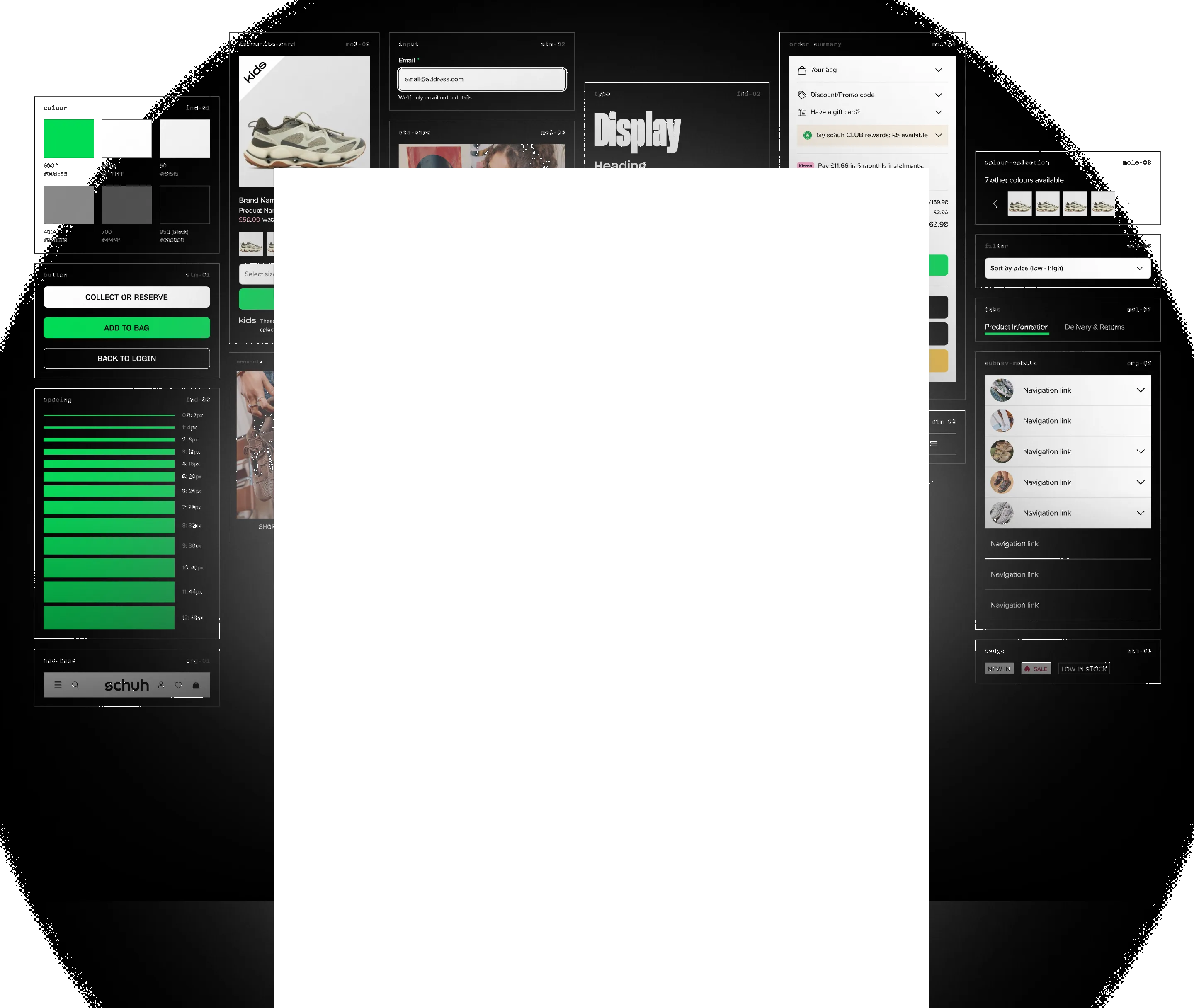
Colour, typography, spacing, and effect tokens structured for scalability, a foundation the component library could sit on and evolve from.
03
Component library
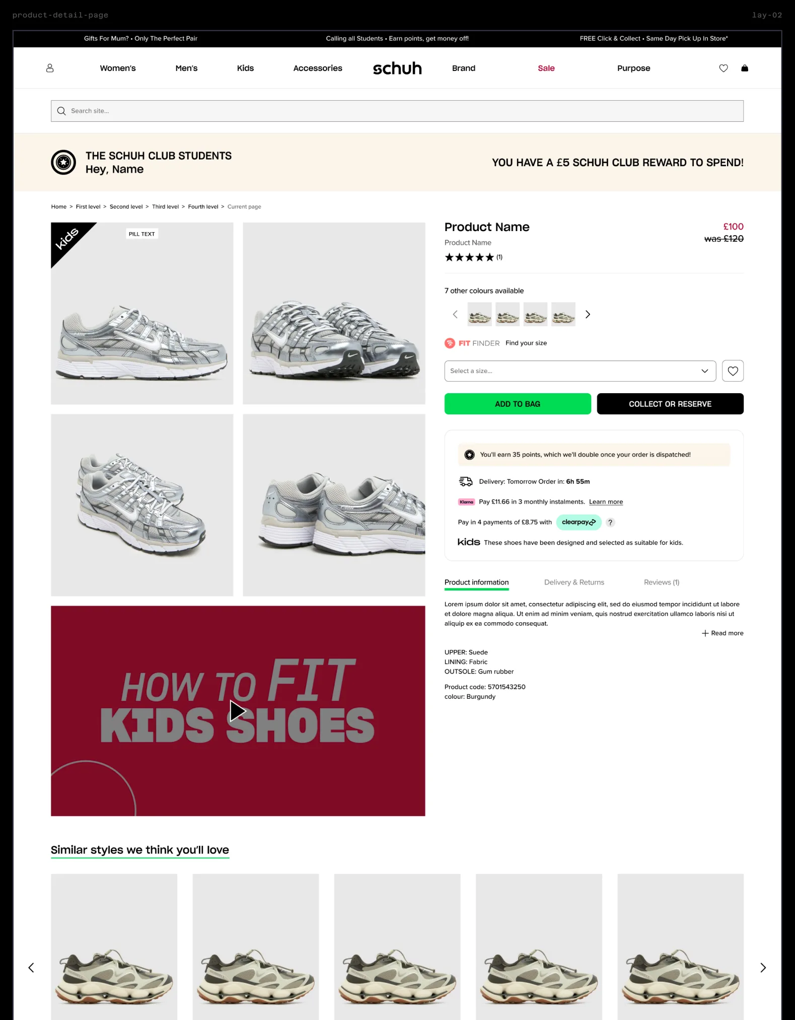
A complete Figma component set, replicating and improving on the live site, built responsively, and to the token system, with clear variants, states, breakpoints, and documentation embedded in the file.
04
Documentation and training hub
Governance documentation, usage guidelines, and a training resource built to transfer knowledge permanently into Schuh's team, not lock it inside ours.
The architecture-first approach meant the component library was built once, correctly. Removing the rework cycles that typically double design system timelines.
What we delivered
Token system
Colour, typography, spacing, and effect tokens — the backbone of the system.
Component library
Responsive Figma component set and page layouts, with variants, states, and handoff-ready specs.
Training hub
Governance docs, usage guidelines, and onboarding material for Schuh's team.
“Our new design system has transformed the way we work. It keeps our digital experiences consistent with our brand, speeds up the design process, and gives developers a much clearer foundation to build from.”
Scott WilsonSenior UX & CRO Manager, Schuh
One source of truth established
For the first time, every designer, developer, and stakeholder was working from the same set of decisions. No more divergent components, or uncertainty over what was live.
Speed at scale
Moving from a fragmented system to a governed one, for a retailer at Schuh's scale, is a material saving in compound time and rework costs.
Built to evolve, not just deliver
The training hub and governance documentation mean Schuh can extend the system as their product grows, without calling us every time.
Knowledge embedded, not held hostage
The system belongs to Schuh. Honcho's goal was to make ourselves unnecessary, and that's exactly what happened.
Need a design system?
Let's talk about what that looks like for your team.